Respectfully Modernizing a Classic
We were excited in 2005 to be asked to restore and expand the Addison Gallery of American Art, a museum designed by Charles Platt in 1930 for Phillips Academy Andover. Phillips Academy is a distinguished boarding school in Massachusetts that was founded in 1778. Our addition would increase the museum’s size by half and refurbish the building top to bottom.
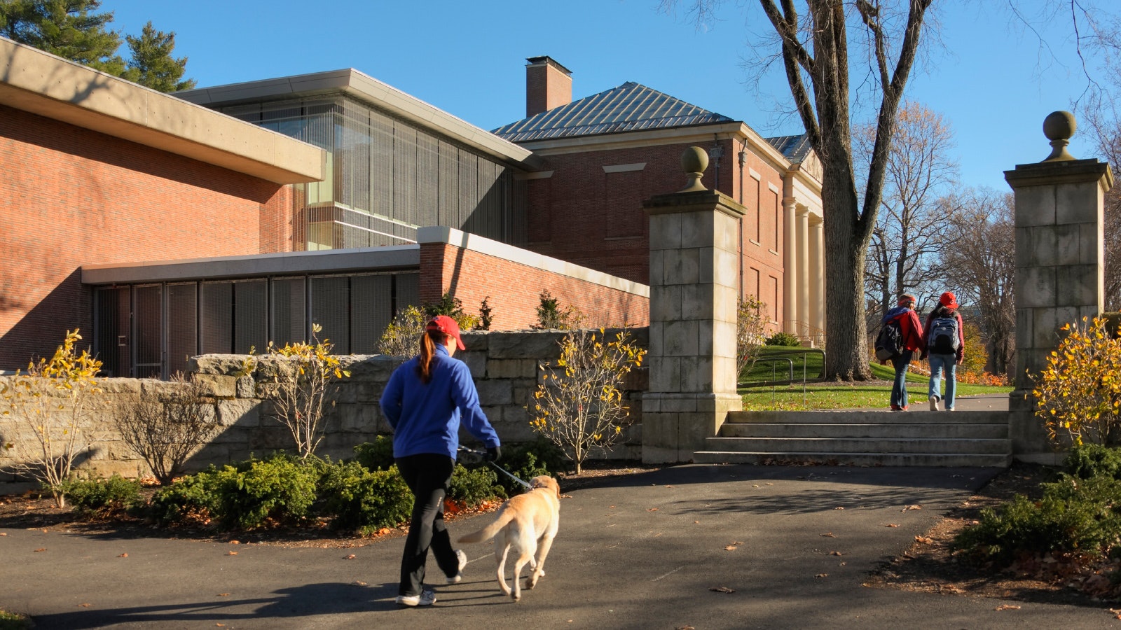
We were asked to respect the building’s formal relationship fronting a broad green that had been ridden across by General Washington during the Revolutionary War and reconfigured a century later by Frederick Law Olmstead.
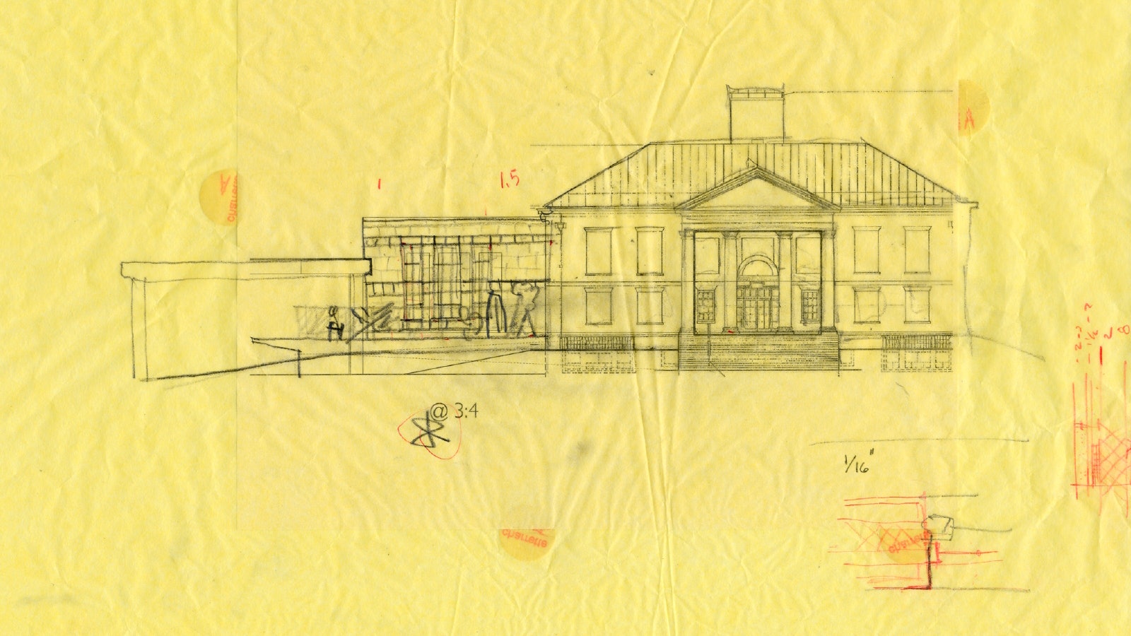
We also had to accept that the only possible place for a 13,000-square-foot addition would be in a convenient notch between the venerable Addison Gallery and an adjacent, mid-century, “Brutalist” studio arts building designed by The Architects Collaborative.
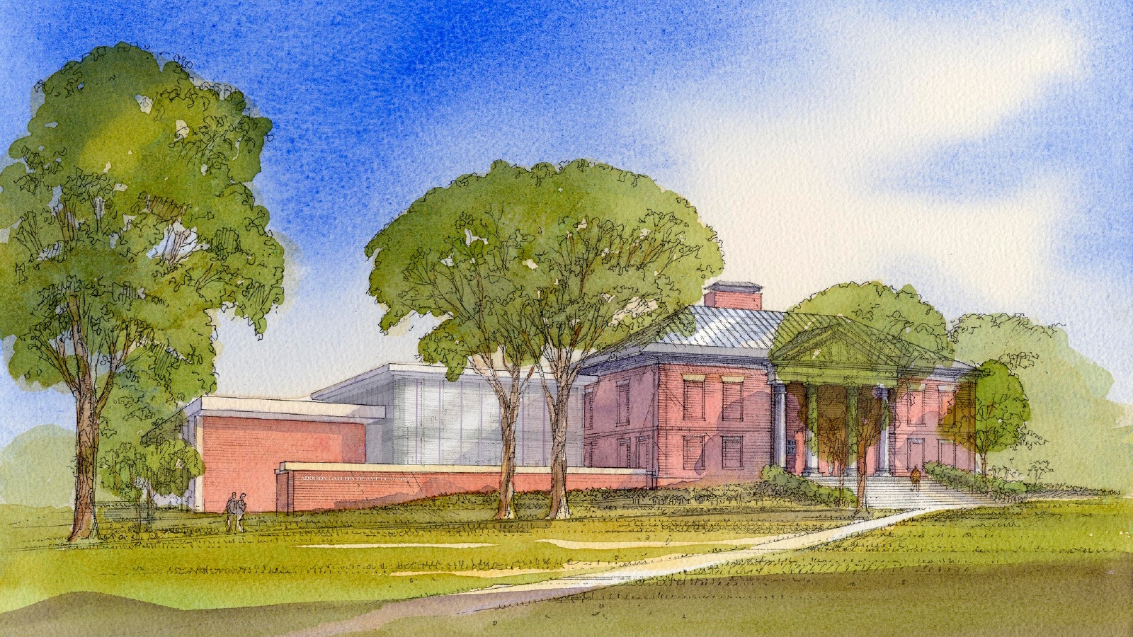
Despite its sublime Georgian proportions, Platt’s museum presented a not-so-friendly, buttoned up face to the world, its windows bricked in eighty years ago by Platt, himself. The museum staff hoped for generous windows that would let light in and make the place more welcoming. Some at the Academy were not so sure about a contemporary glass aesthetic, fearing a modern addition to Platt’s traditional brick might have a disjointed effect.
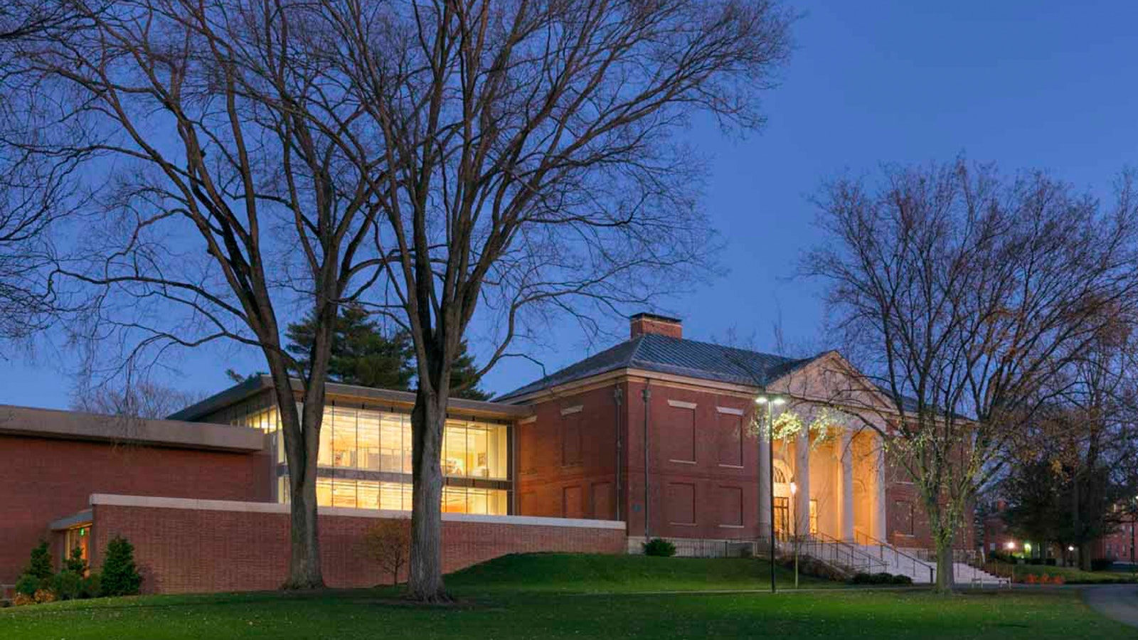
To us, transparency meant glass, but we could see that glass on its own would be too reflective, too crisp, and too harsh to suit our client. So we proposed a modern window wall enclosure inside a diaphanous, geometric outer layer of stainless steel mesh that we thought would soften the look of the glass and be a veil of mystery.
We called this idea a “filter box” and saw it as a two-story structure sitting atop a green-roofed plinth.


We predicted our shrouded box would be interesting without overwhelming Platt’s building. Our argument turned on the idea of layering. We believed the box’s inner window-wall could provide the desired transparency but that our outer layer of stainless steel mesh would calm the glass’s shine, making the whole assembly sometimes transparent, sometimes translucent, and sometimes opaque depending on the angle and amount of sunlight striking it.
Here we were drawing from past experience working with theatrical scrims, which are gauzy stage drops. A scene dry-painted on them magically fades out as lighting moves from front to back, in the process bringing into view whatever is behind the scrim.
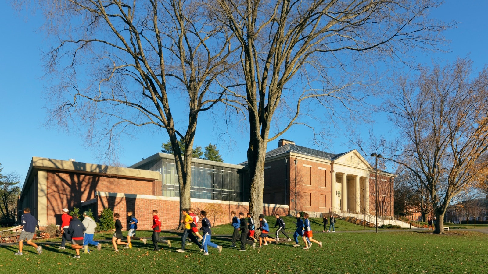
Our design predictions about these effects held up. In direct sunlight the inner layer of glass is pushed to the back and de-emphasized as the stainless steel picks up a shine from the sun.
During the day the stainless steel layer holds direct sunlight on its surface, hiding the inner glass and making our addition appear somewhat opaque and a little shiny. As the sun angle changes you can see through the mesh better.
As sunset comes on, sunlight is striking the mesh no longer, making it transparent and allowing the building interior to materialize like some kind of hologram. The transformation occurs differently each day as light conditions vary. It is a subtle but fascinating phenomenon to observe.


On our filter box’s upper level, the museum’s new offices enjoy sweeping views of the campus green. At the filter box’s lower level, a new Learning Center gives students and scholars a wonderful place to examine objects under the supervision of curators. The Learning Center is equipped with secure storage for objects. Interior concrete coffered ceilings are exposed. Mechanical, fire protection, acoustic, and other elements reside visibly within each coffer.
The filter box looks out over a green roof populated by a grouping of Dale Chihuly’s “Floats.” This level also houses the museum’s art library. Under the green roof plinth, art storage and collections management are sequestered. So, too, is a secure loading dock, hidden behind its own veil of stainless steel mesh.
We gave the existing lobbies and galleries lots of attention. This meant opening up the walls and inserting new systems, then putting them all back together again seamlessly. All electrical in the building is new, from the transformer outside to lighting consultant George Sexton’s elegant fixtures in our gallery ceilings.
In the main gallery upstairs we integrated new track lighting into the laylight without damaging Sol Lewitt’s mural that previously had been installed on the ceiling’s cove.
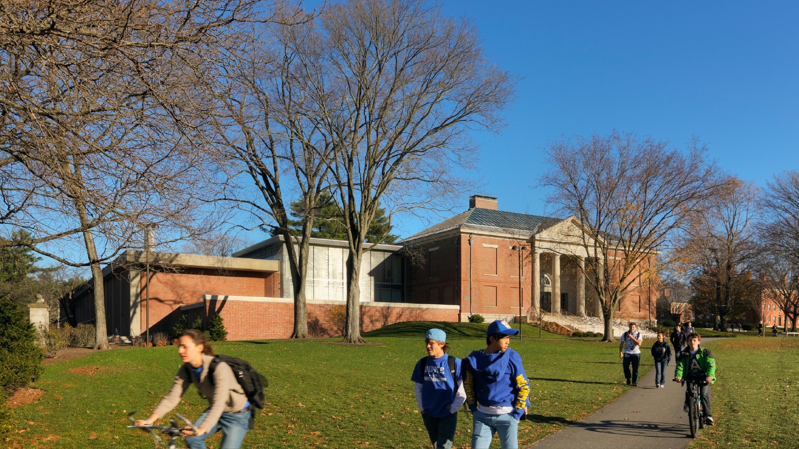
With our overall architectural composition we tried to present a “feeling of two” between the original museum on the right and more recent constructions on the left, including our own. Our hope was to make the imprint of the original building evident.
We also tried to put our addition as much as possible in harmony with Platt’s Georgian aesthetic. We did this with similar proportions but also with the rhythm we set up in the mesh panels around the filter box. It’s a rhythm similar to what Platt himself set up in his spacing of columns across the Addison’s Greek Revival portico. Our intention was that the filter box convey an elegant classical sensibility while being a crisp work of its own time.
We're using cookies to deliver you the best user experience. Learn More